Map design · 8 minute read
Start with purpose, not the palette.
A practical guide to making a custom city map: choose the frame, build a visual hierarchy, edit the layers, and export for the place the map will live.
01 · Purpose
Decide where the map will live.
A custom city map is not finished when the roads look attractive. It is finished when it works in the place you made it for. A social image must survive a small screen and an aggressive crop. A presentation needs quiet structure behind other information. A map of a hometown or a trip can carry more detail because the place itself is the subject.
Write the destination down before opening a color picker. For a timeline post, favor one strong silhouette and a few readable labels. For a slide, preserve contrast around the area where copy will sit. For a personal city map, decide which river, coastline, ring road, or district pattern makes the place recognizable to someone who knows it.
02 · Frame
Let the city choose the crop.
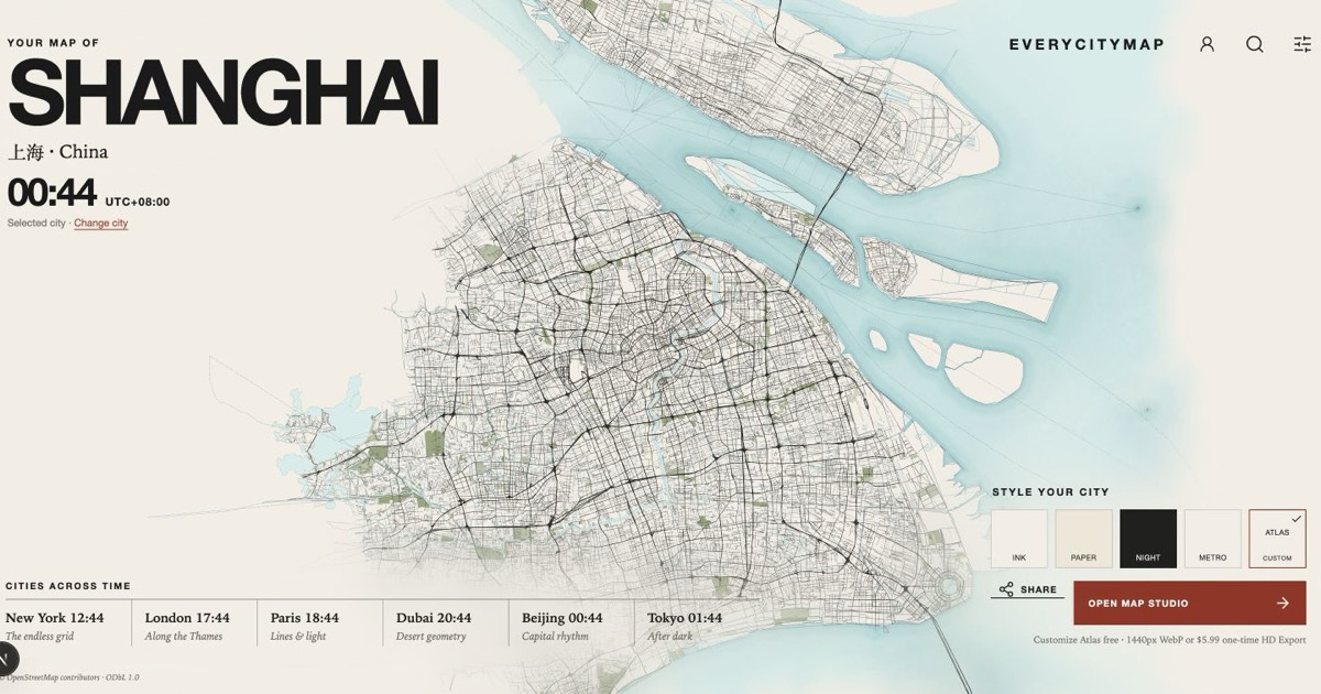
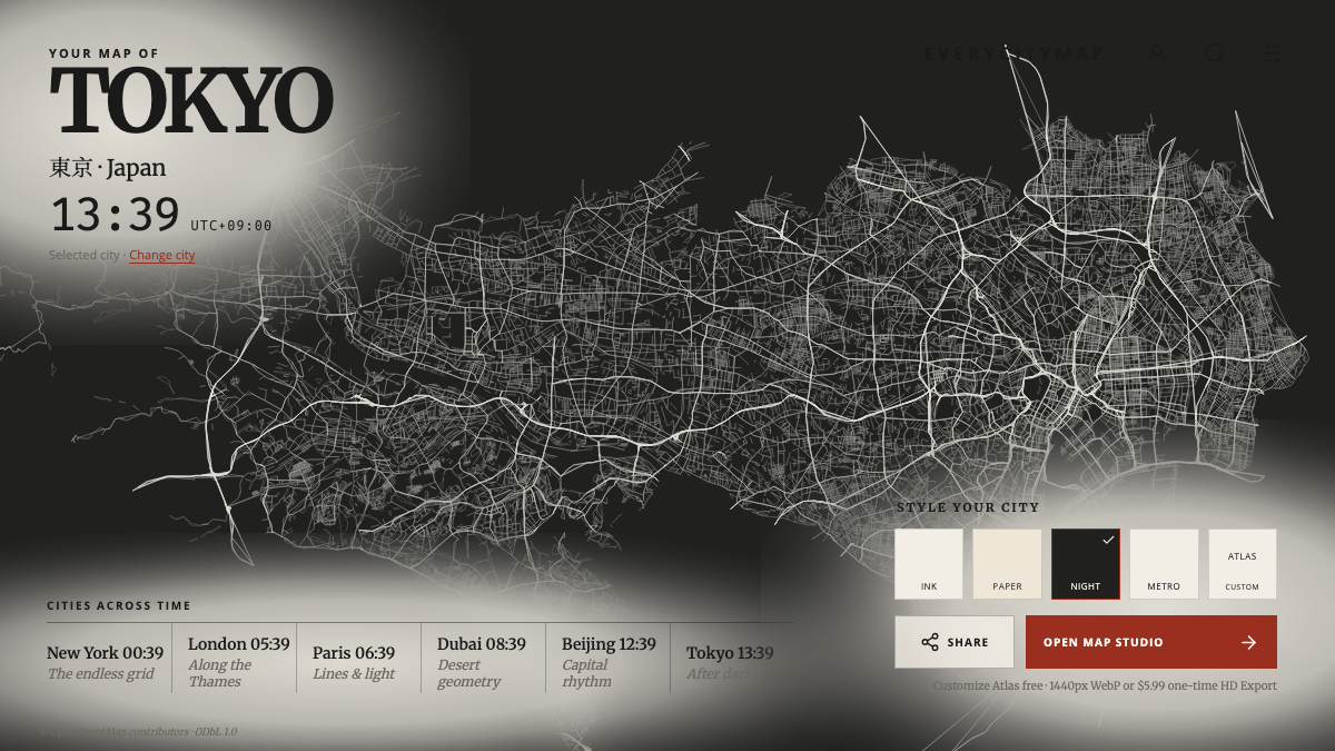
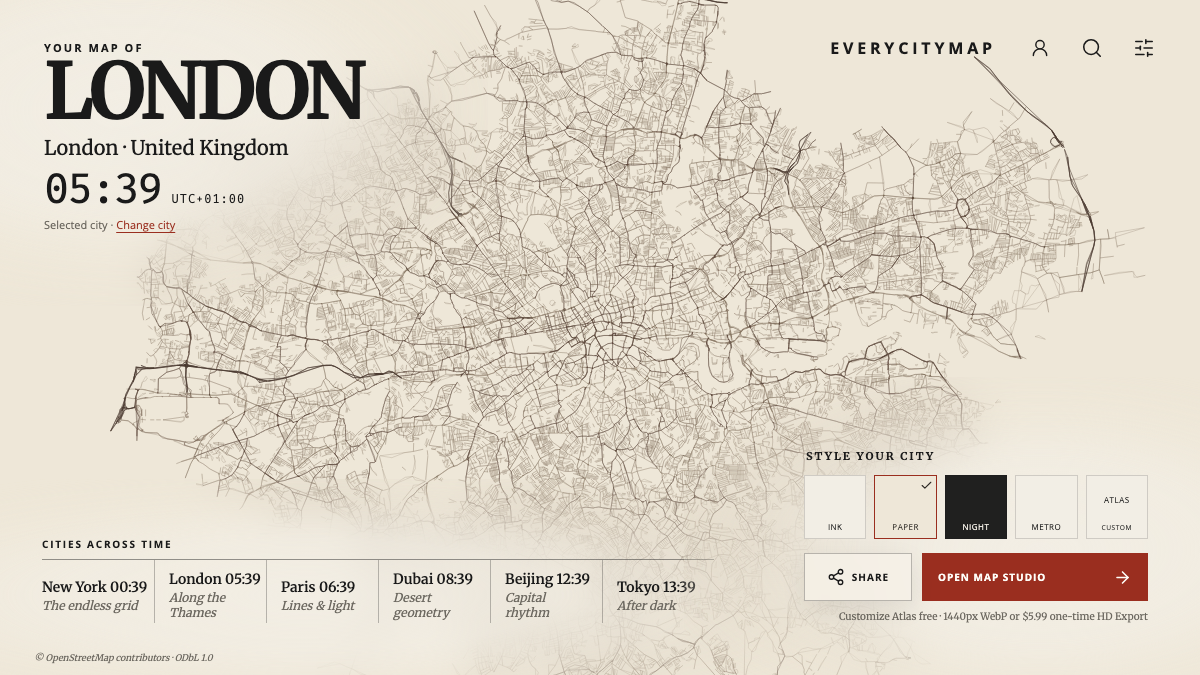
A generic rectangular viewport is convenient, but it can hide the logic of a place. Tokyo needs the relationship between dense rail corridors and the bay. London needs the Thames to hold the composition together. Shanghai changes when the Huangpu becomes a divider instead of background decoration.
EveryCityMap starts from a reviewed city frame and then fits the geometry to the canvas. You can still change detail and styling, but you are not beginning with an accidental zoom left over from a search box. That makes comparisons between cities more honest and gives the final image a clearer identity.
03 · Hierarchy
Make fewer layers speak more clearly.
Street data is detailed by nature. A readable map is selective. Start with the relationship between land and water, then decide how strongly the primary roads should speak. Secondary streets should support that structure rather than compete with it. Rail, parks, functional surfaces, and labels are useful only when they survive at the final size.
- Background and waterSet the largest areas first; they establish the mood and overall contrast.
- Primary roads and railUse them to reveal the city structure, not to display every available feature.
- Secondary detailReduce it until the map remains calm at the actual viewing size.
- LabelsKeep only the names that help orientation or carry meaning for the project.
04 · Edit
Use a theme as a starting point, not a verdict.
Ink, Paper, Night, and Metro provide coherent starting directions. Atlas is the useful choice when the project needs its own hierarchy. Change one family of decisions at a time: first the large surfaces, then road classes, then labels and supporting layers. If every control changes at once, it becomes difficult to see which decision improved the map.
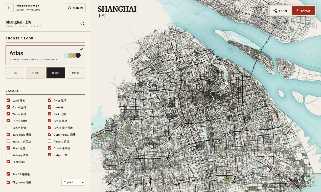
Open a real city while you read: try the Shanghai Studio, Tokyo Studio, or London Studio. Editing does not require an account.
05 · Output
Judge the map at its destination size.
Zooming into a canvas can make every thin road feel important. The final image is less forgiving. Before exporting, view the map near the size it will actually appear. Check the outer edges for social crops, confirm that important labels remain readable, and make sure the dominant road network still has a clear order.
The free output is compact, sharp, and sufficient for most screen work.
Choose HD only when the layout needs more pixels or a transparent background.
A DPI label by itself does not make an image print-ready; real print quality depends on the pixel dimensions at the intended physical size. EveryCityMap currently describes its outputs by what they actually deliver instead of making a generic print promise.
Try the ten-minute workflow