Layered center
Historic texture meets planned outer districts.
 Account
Italy · Europe
A Rome map brings together the Tiber, an irregular historic center, radial roads, large archaeological and green areas, and much more regular twentieth-century districts. The result is layered rather than uniform. A useful design lets the river and major routes organize the frame before fine streets supply texture.
Free to style and share · no account required
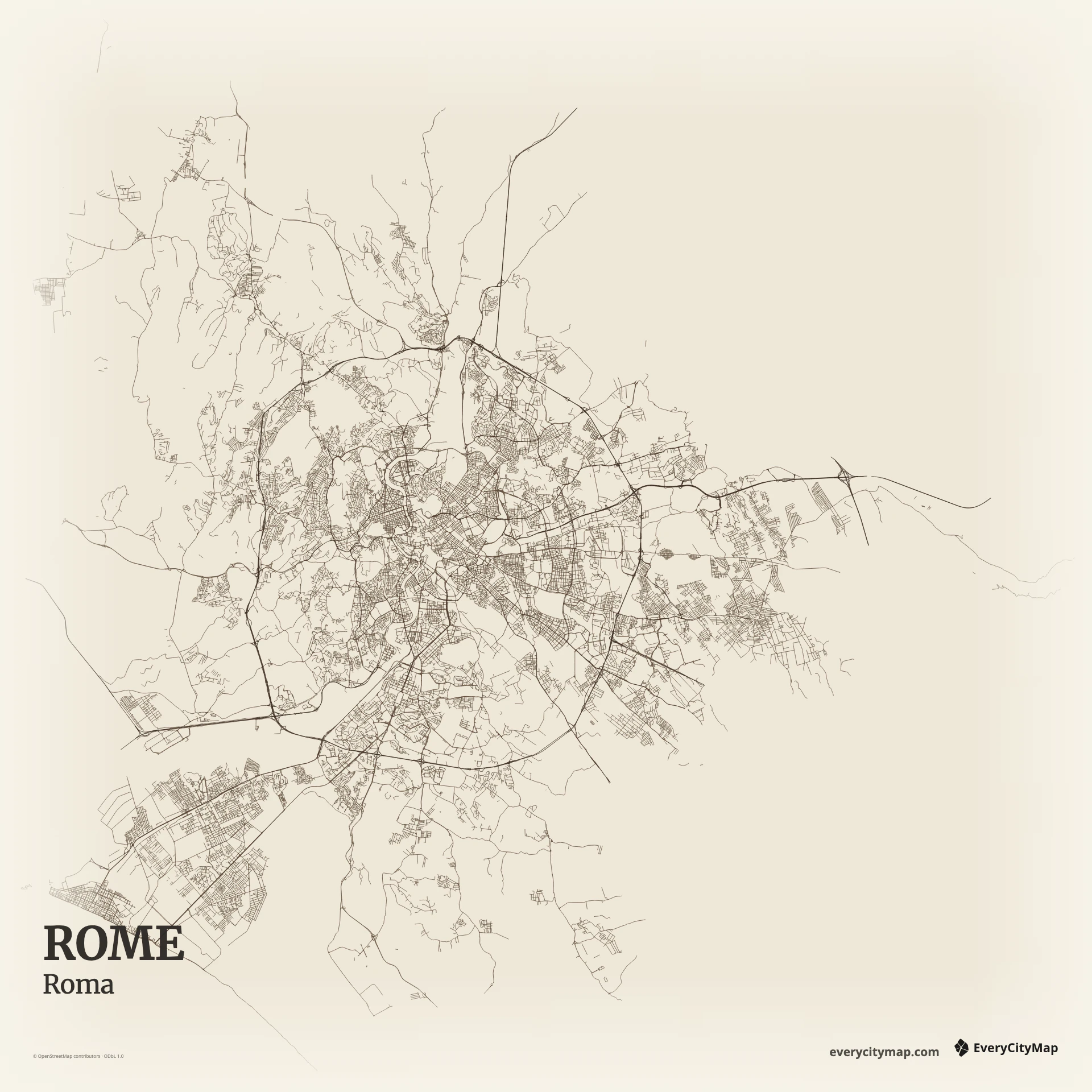
Three decisions that make this city recognizable before a label is added.
Historic texture meets planned outer districts.
Major routes organize streets that resist a grid.
A continuous river line guides the central composition.
Start with geography, then decide how much street detail the image can hold.
Central streets turn around older spaces and rarely settle into a continuous grid. Farther out, larger avenues and planned districts introduce stronger geometry. That contrast is the map's main source of depth. Keep local streets lighter so the transition can be read without relying on district labels.
The Tiber makes a sequence of bends through the center and around Isola Tiberina. It is narrow compared with the full urban area, so excessive road density can easily hide it. Strengthen the river first, then preserve selected parks and open areas to break the continuous street texture.
Paper supports Rome's layered historic texture without making it feel diagrammatic. Atlas is better when river, green space, and road classes need separate tuning, while Ink produces a graphic street study. Keep the Tiber continuous through the frame; short disconnected blue segments make the center harder to understand.
Rome suits a travel print, an editorial background, or a comparison of historic street patterns. A central portrait crop can follow the Tiber; a wider city view reveals the shift from old center to planned districts. Reduce fine roads before export when the image will be viewed primarily on a phone.