Grid contrast
Eixample meets the irregular old city and slopes.
 Account
Spain · Europe
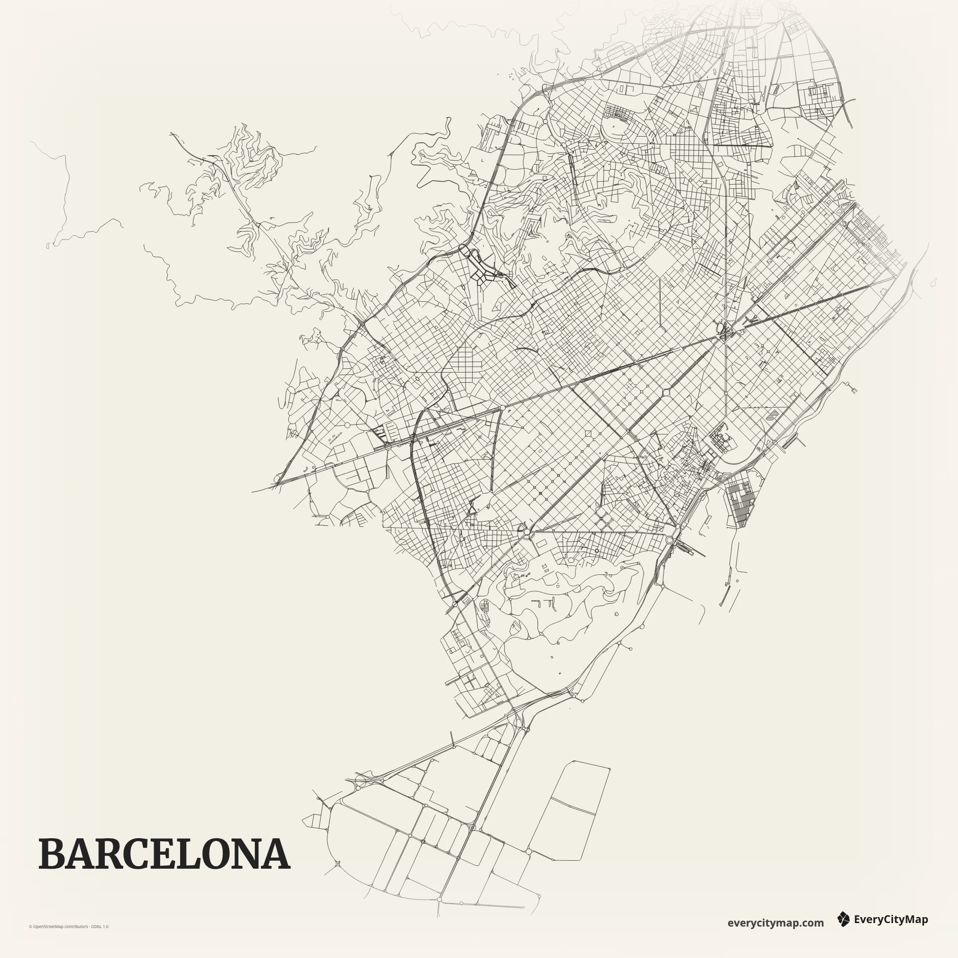
A Barcelona map has one of the clearest urban contrasts: the regular chamfered blocks of the Eixample meet the tighter old city, the Mediterranean waterfront, Montjuïc, and the irregular streets near the hills. That contrast makes the city recognizable even without landmark symbols.
Free to style and share · no account required
Three decisions that make this city recognizable before a label is added.
Eixample meets the irregular old city and slopes.
Major avenues interrupt repeated chamfered blocks.
The coast keeps the grid within a larger landscape.
Start with geography, then decide how much street detail the image can hold.
The Eixample grid is strong enough to dominate the image, but its value comes from meeting other patterns. Ciutat Vella is finer and less regular, while diagonal avenues cut across the blocks. Let the main avenues interrupt the repetition and keep local grid lines thin enough that individual blocks still remain visible.
The coast establishes a long southeast edge, with port structures and beaches introducing different geometries. Montjuïc and the northern hills create open interruptions on the land side. A balanced frame includes both water and rising urban edge so the Eixample is understood as part of a larger landscape.
Ink makes the Eixample grid immediately visible. Atlas is stronger for a composition that includes coast, green space, and port, while Metro can highlight diagonals and major avenues. Avoid making every grid street heavy; the pattern reads best when block rhythm is present but the coast and old city still compete for attention.
Barcelona is ideal for a bold social image, a travel poster, or an urban-form comparison. Landscape framing follows the coast, while portrait framing can connect waterfront, grid, and hills. At small export sizes, emphasize the grid boundary and a few diagonals instead of trying to preserve every block line.